Think back to your favorite clothing brand. What colors, fonts, logos, frames, graphic figures are associated with the memory of it? It's all about brand identity. Even if it's a logo, you can figure out the identity ingrained in your memory within seconds by the combination of hues and lettering, visual associations.
Now we share how we've created an aesthetic and functional brand identity which conveys the values of the Clóser lingerie brand.


The essence of the Clóser brand.
"Exploring the world through feeling. Tasting life. Waking up what sleeps. To invent rituals of love towards yourself, to take care of yourself. To be face to face with your desire. To play and enjoy."
"Exploring the world through feeling. Tasting life. Waking up what sleeps. To invent rituals of love towards yourself, to take care of yourself. To be face to face with your desire. To play and enjoy."


Values, ideas, meanings
The values, ideas, and meanings that the customer presented matched our vision, which is especially gratifying and rewarding.
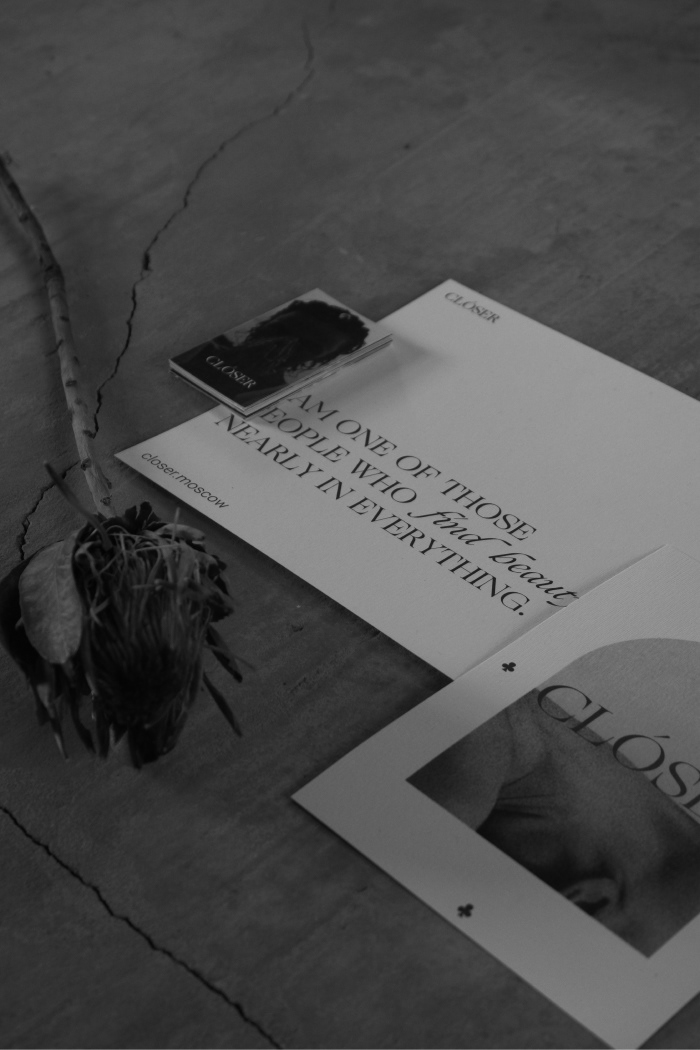
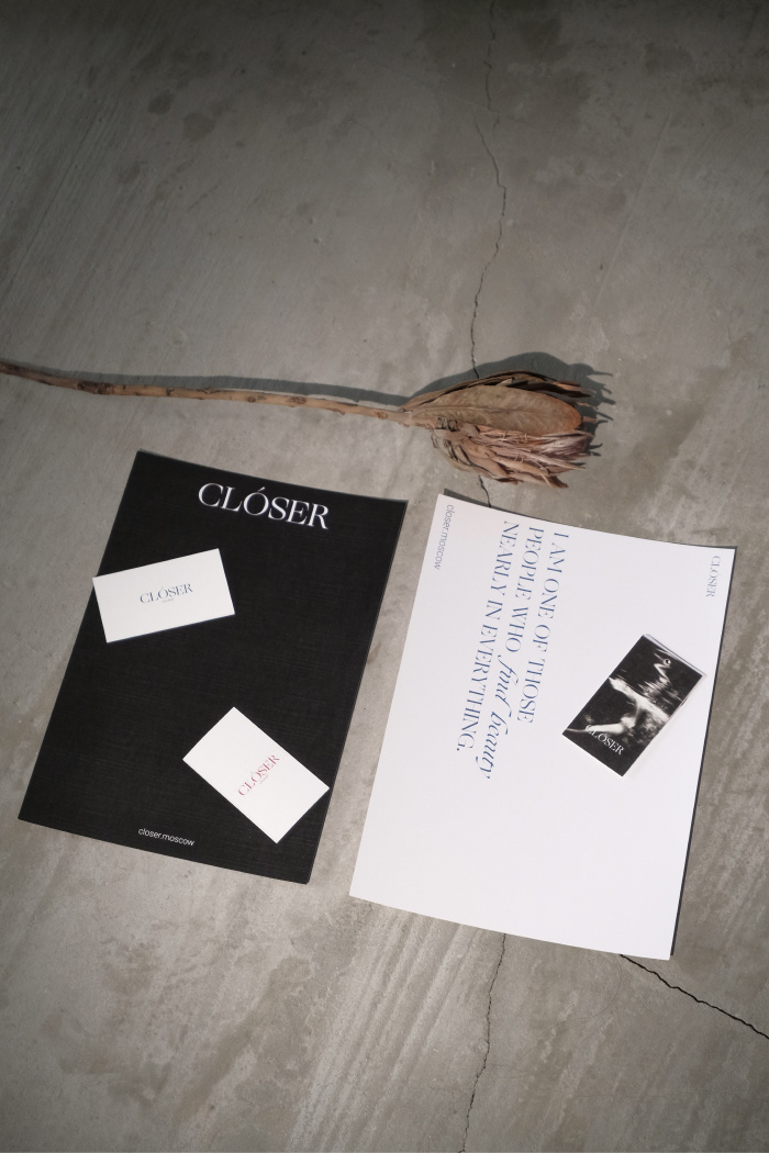
During the in-depth briefing stage we worked through the themes of Tarot cards, antiquity, and unconcealed sexuality. We had to reflect in the visual form sensuality, playfulness, the emotions of pleasure from interaction with oneself and the partner. Thinking about this we immersed ourselves in the study of antique paintings, engravings, runology.
The values, ideas, and meanings that the customer presented matched our vision, which is especially gratifying and rewarding.
During the in-depth briefing stage we worked through the themes of Tarot cards, antiquity, and unconcealed sexuality. We had to reflect in the visual form sensuality, playfulness, the emotions of pleasure from interaction with oneself and the partner. Thinking about this we immersed ourselves in the study of antique paintings, engravings, runology.


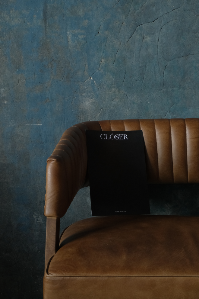
Font
Associations with the Tarot, runes, ancient visual art, suggested that the concept of antiqua font was most applicable in this case. Antiqua is a clear and readable font, which is at the core of any identity. On the level of feeling, it is associated with classics, warm motifs, something close and therefore valuable. Additional grotesque font establishes a connection with modernity, our days, vertical movement.
Associations with the Tarot, runes, ancient visual art, suggested that the concept of antiqua font was most applicable in this case. Antiqua is a clear and readable font, which is at the core of any identity. On the level of feeling, it is associated with classics, warm motifs, something close and therefore valuable. Additional grotesque font establishes a connection with modernity, our days, vertical movement.


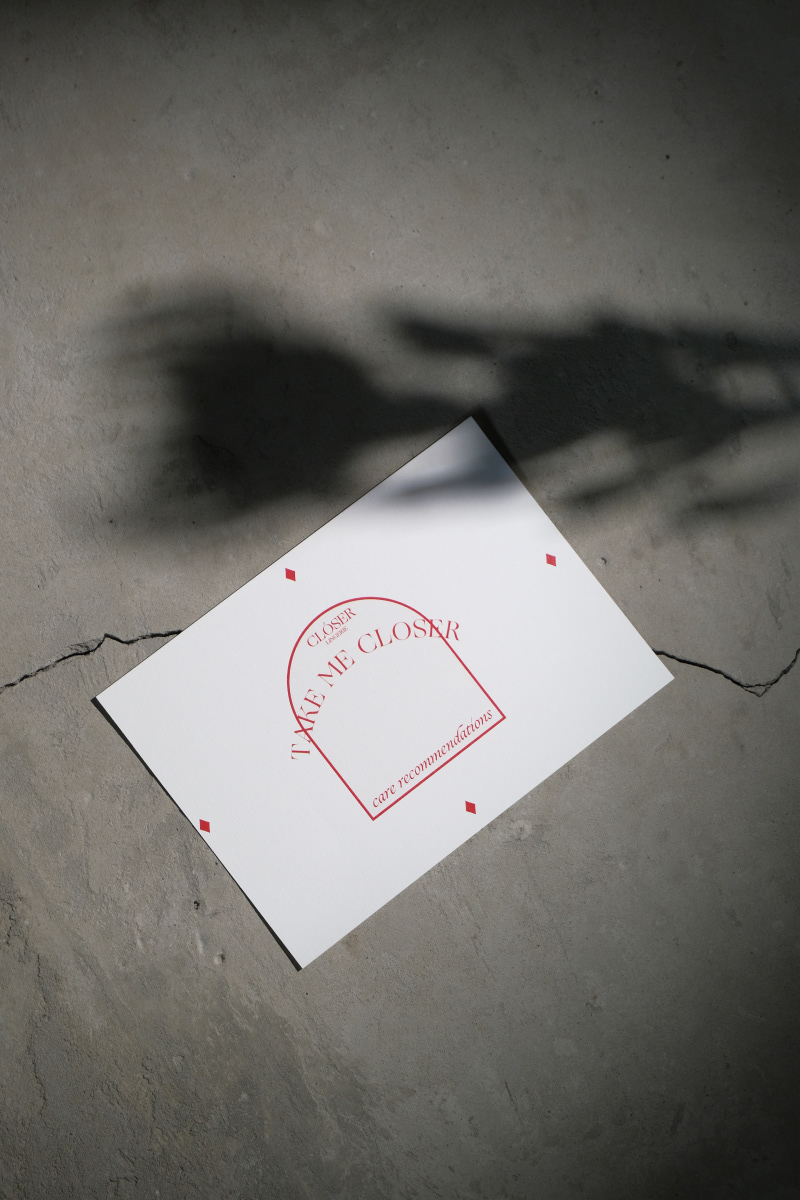
Colors
We chose two main colors to reflect the essence of the brand: deep blue, and I'm not afraid to say it - blood-red.
The deep blue represents the calm sea, the connection with nature. Red is a direct approximation to blood, something that flows in all of us and makes our lives possible. This overt metaphor seems to us a strong basis for a conversation about Clóser values.


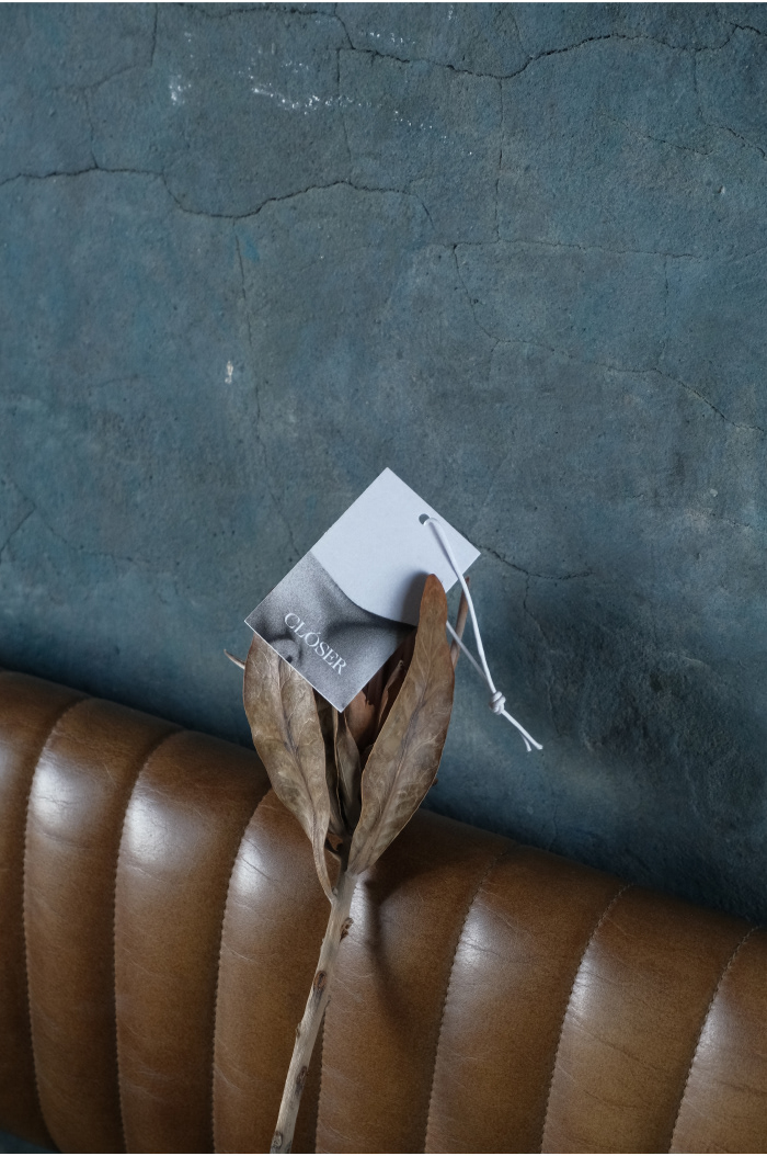
Details
During the brand identity phase, we laid down some of the brand phrases in the format of small poems and stories from author Anna Andreeva. She formulated basic, fundamental phrases, mini-stories and expressions that are built into the overall idea.
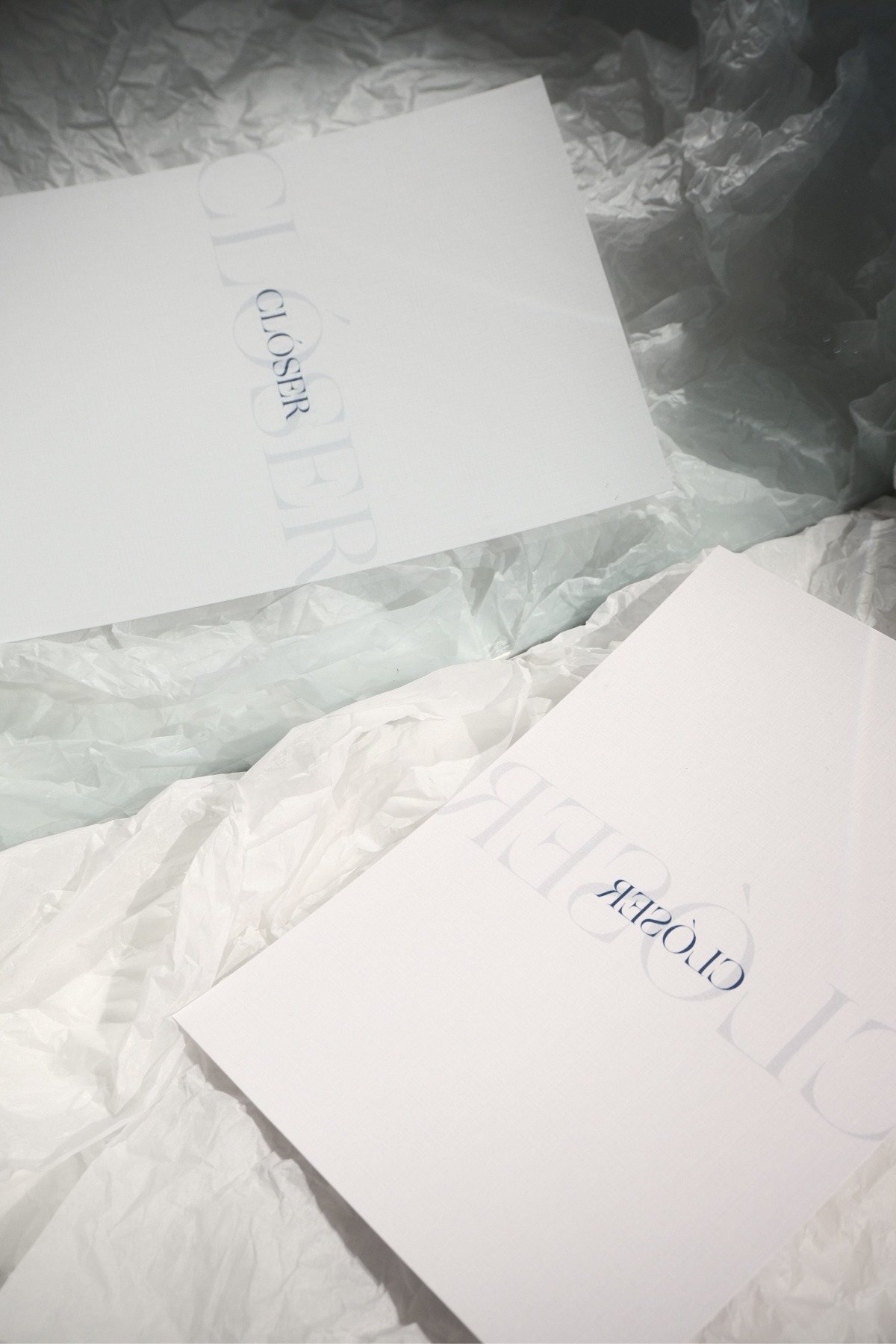
The main brand phrase is "Take me closer": to be nearer. On one medium, it's broken down into parts: "Take me" stays on matte translucent paper, "closer" stays on matte rough cardboard. When both media are connected, the phrases are read together.
During the brand identity phase, we laid down some of the brand phrases in the format of small poems and stories from author Anna Andreeva. She formulated basic, fundamental phrases, mini-stories and expressions that are built into the overall idea.
The main brand phrase is "Take me closer": to be nearer. On one medium, it's broken down into parts: "Take me" stays on matte translucent paper, "closer" stays on matte rough cardboard. When both media are connected, the phrases are read together.


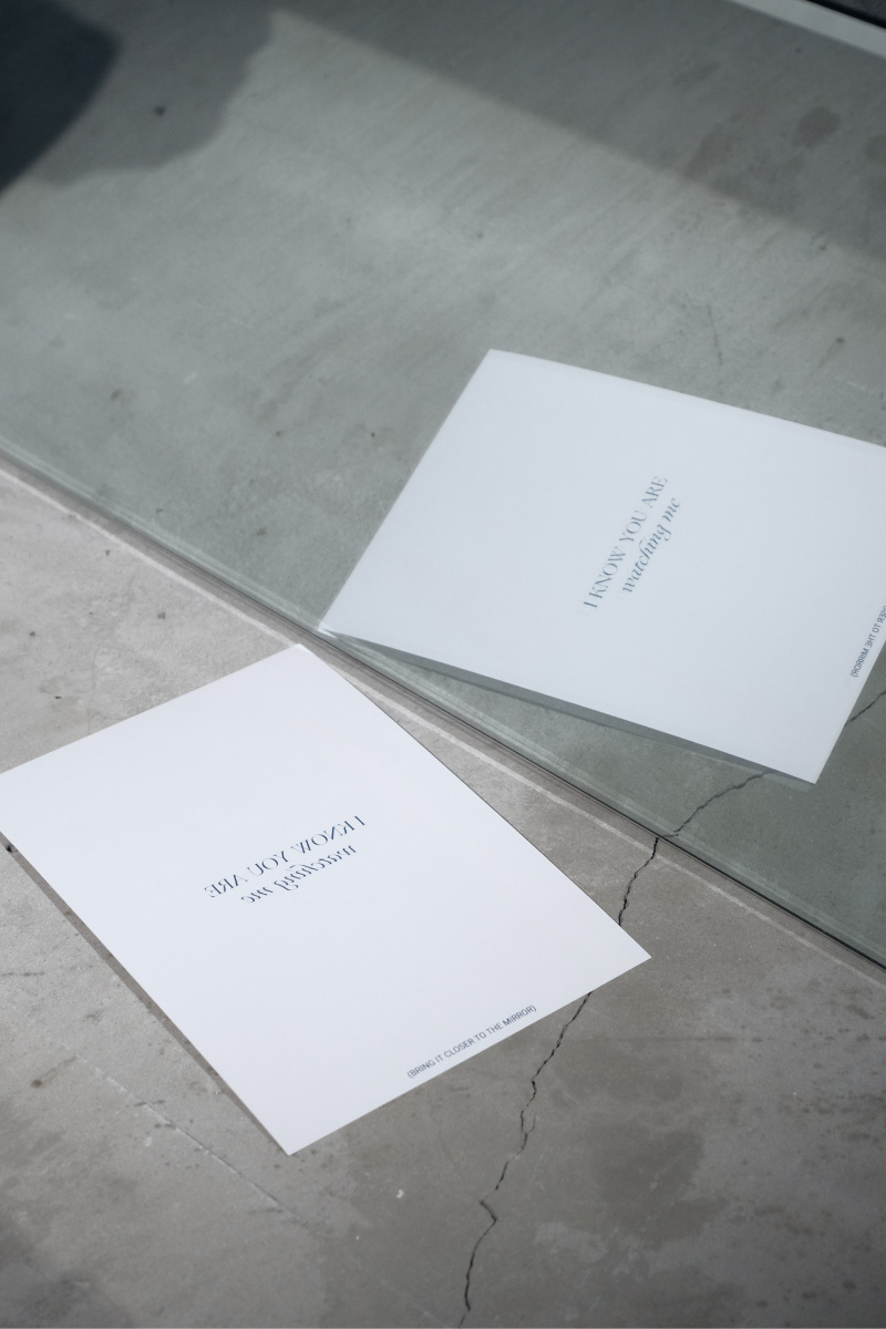
Another detail is the mirror image. We wanted to connect the identity with the idea of coming back to ourselves, to our own sexuality. This is how we came up with the idea of a card on which the text can only be read with the help of a mirror. It's as though it put you on pause: you take the card, go to the mirror and reconnect with yourself, pay attention to your own tenderness and sensuality.