
Hades Hell FIre Hot Sauce
—
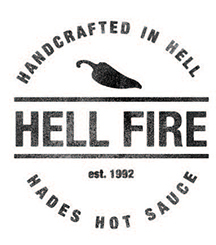
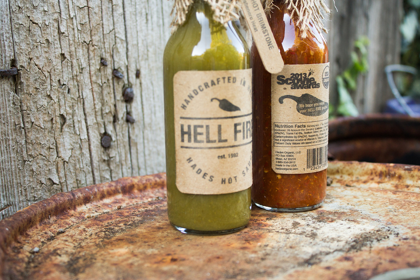
Hades Hell FIre Hot Sauce began as a logo development project inspired by the aesthetic of stamped seals. Specifically the seals you would see on a wooden produce crate.
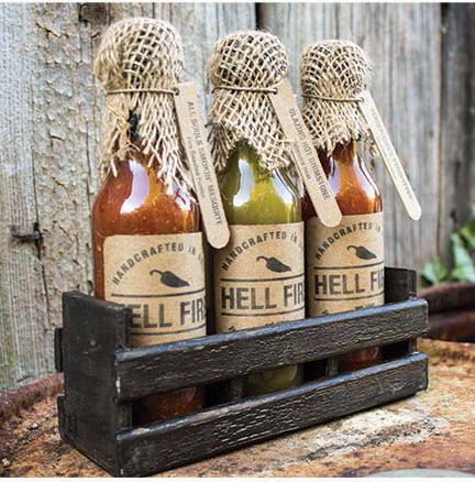
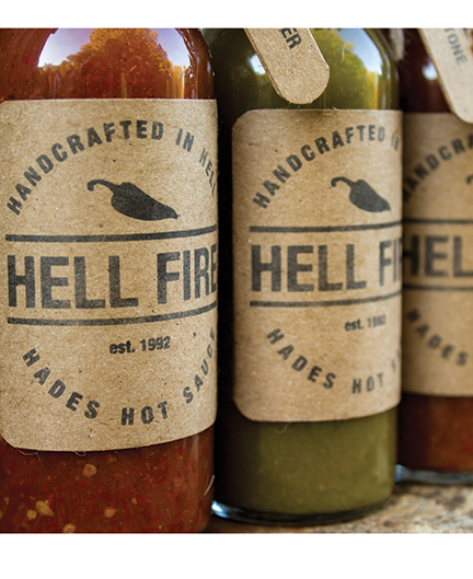
Knowing the product would be sold in upscale grocery and specialty stores, the packaging required a uniqueness that is unexpected in the typical hot sauce product. Brown craft paper and burlap accents elevate the handmade quality and organic ingredients. The stark black logo creates a very pleasing contrast against the natural elements in the packaging.
A custom built wooden crate ties the entire product together giving it a desirable rustic feel. Environmental photography was utilized to create print ads and promotional assets.