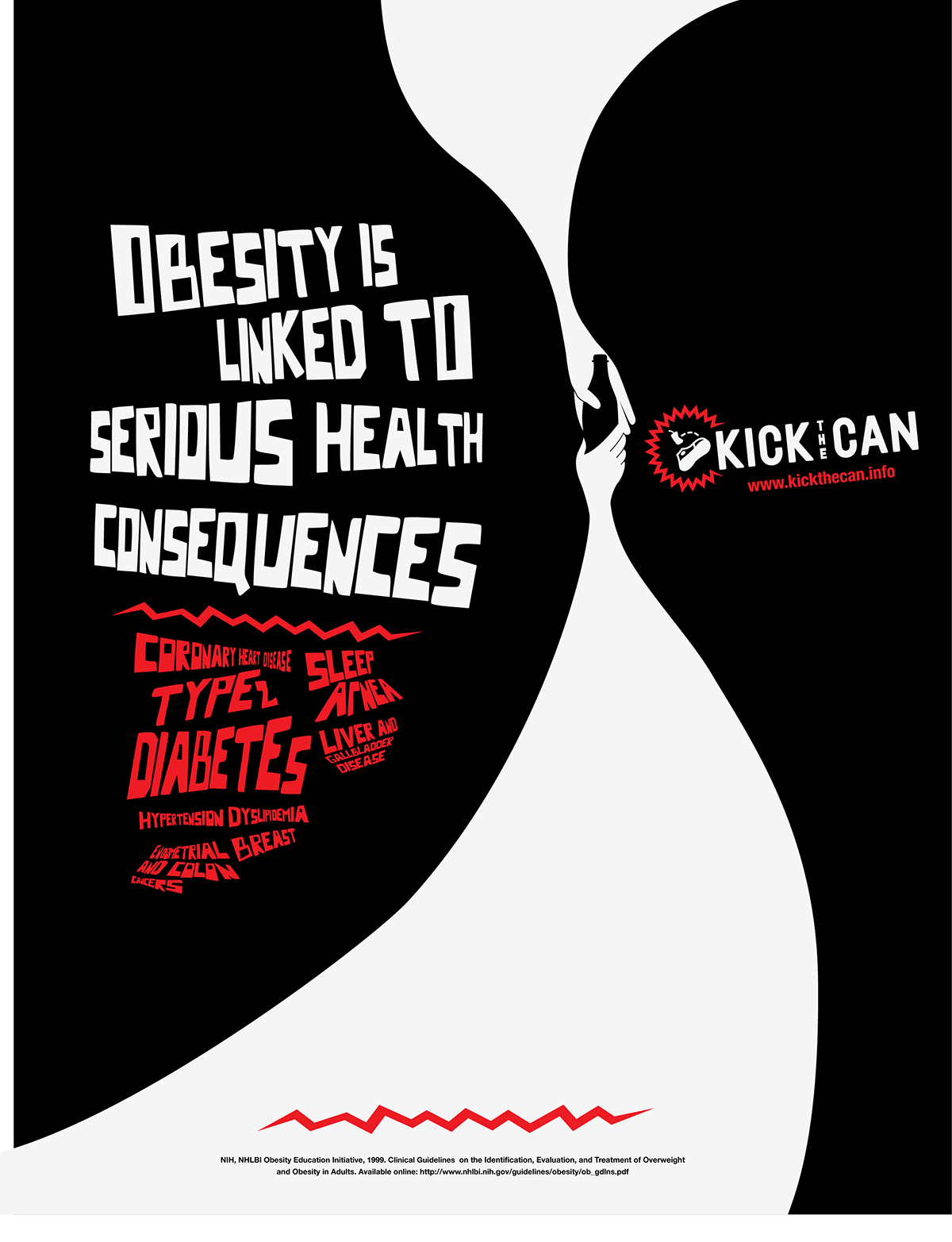
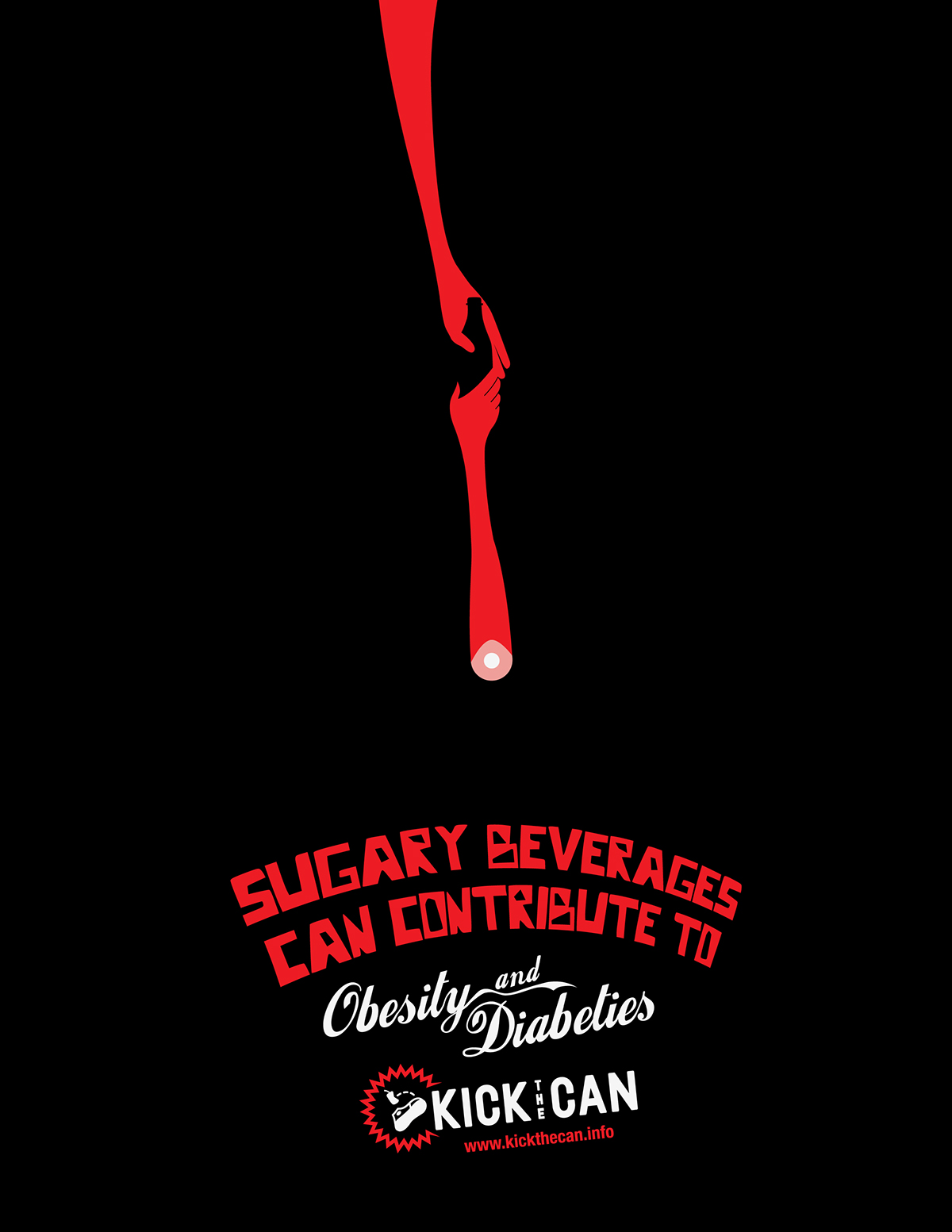
KEEP HEALTH BETWEEN THE LINES
Social awareness poster addresses the consumption of soda and
the effect it has on children’s bodies. Surprisingly there are a good
number of groups that are bringing awareness to this health topic.
The original target audience was to be parents, but I opted to
directed towards teens as the project developed. The solution was
to use drastic measures in a subtle approach such as diabetes and
losing limbs. Not the most effective approach, but it has potential
to convey and communicate the message.

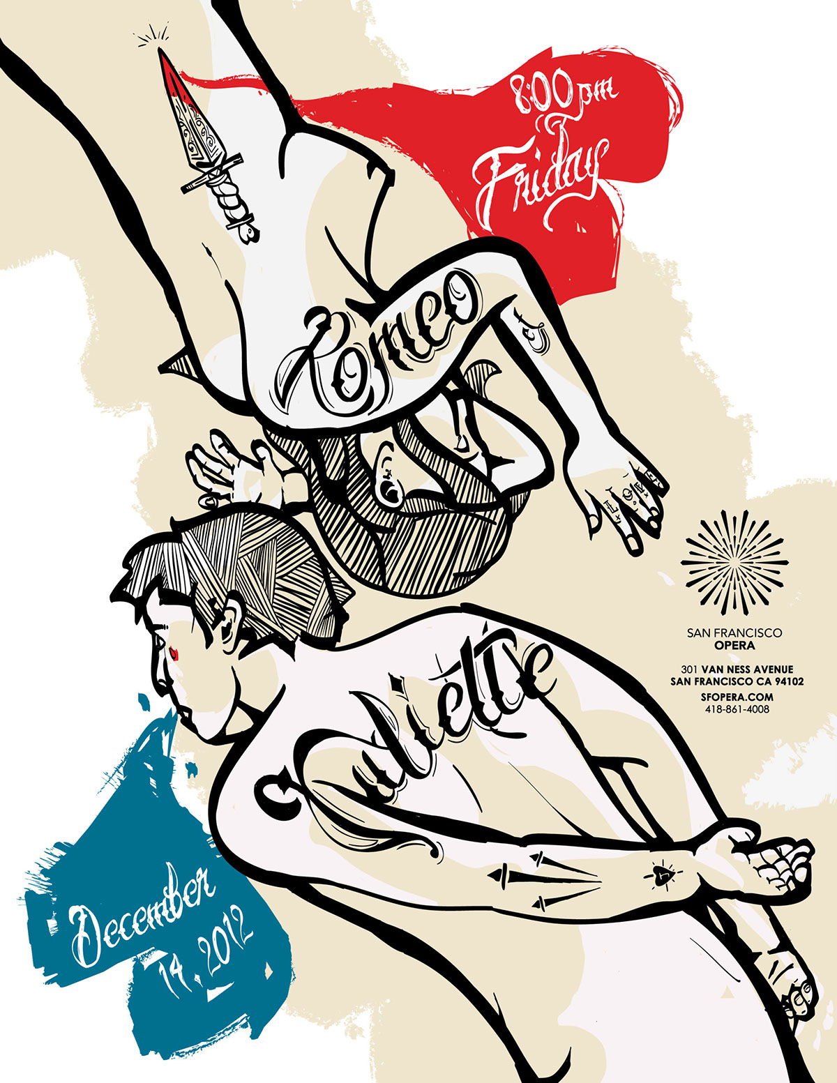
ROMEO et JULIETTE
SFO Opera House
Fictitious Poster Event
In this project, I used a modern approach to a classic story in effort
to get connected to a younger audience to attend Operas. I used
modern day visuals in the form of tattoos to make an attempt to
communicate to a younger audience characteristics.
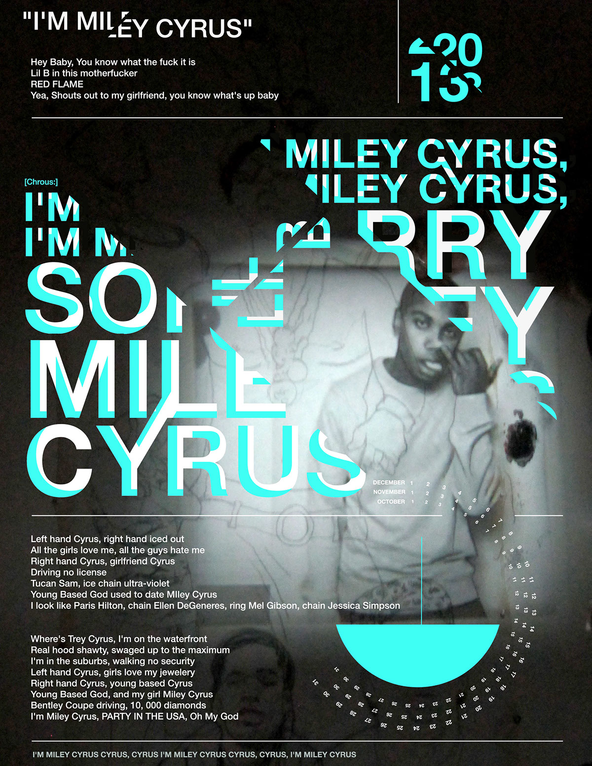
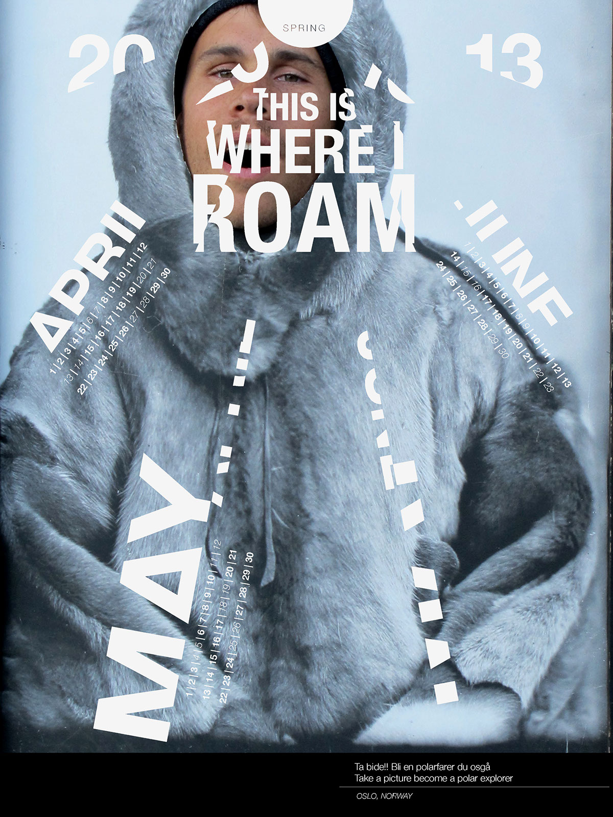
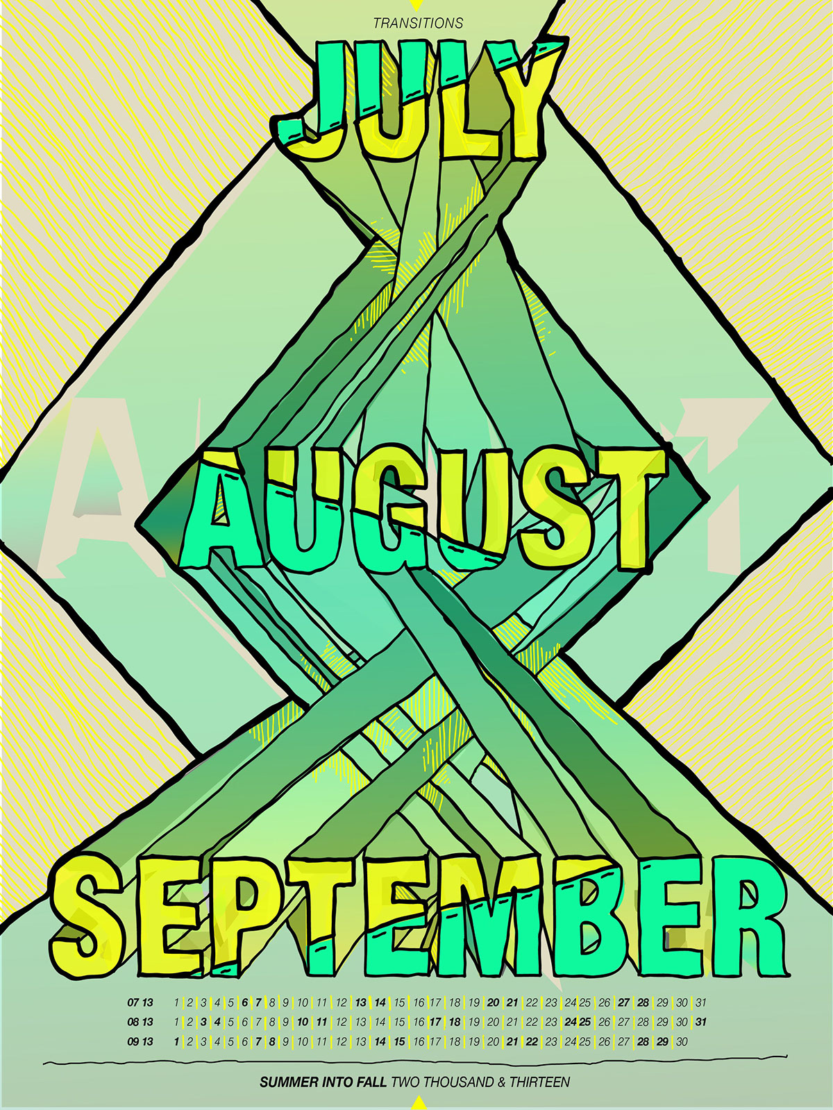
TYPOGRAPHY POSTERS
Assess the type/image relationship of separation, fusion,
fragmentation, and inversion in order to design a poster calendar
that exhibits the metaphorical qualities of the principle.
The project focused on the different treatments of typography;
fragmentation, inversion, separation, and fusion. The concepts range
greatly, but the most thought out example is the second, based off
the folds of a paper airplane.
VISIUAL
INTERPERTAION
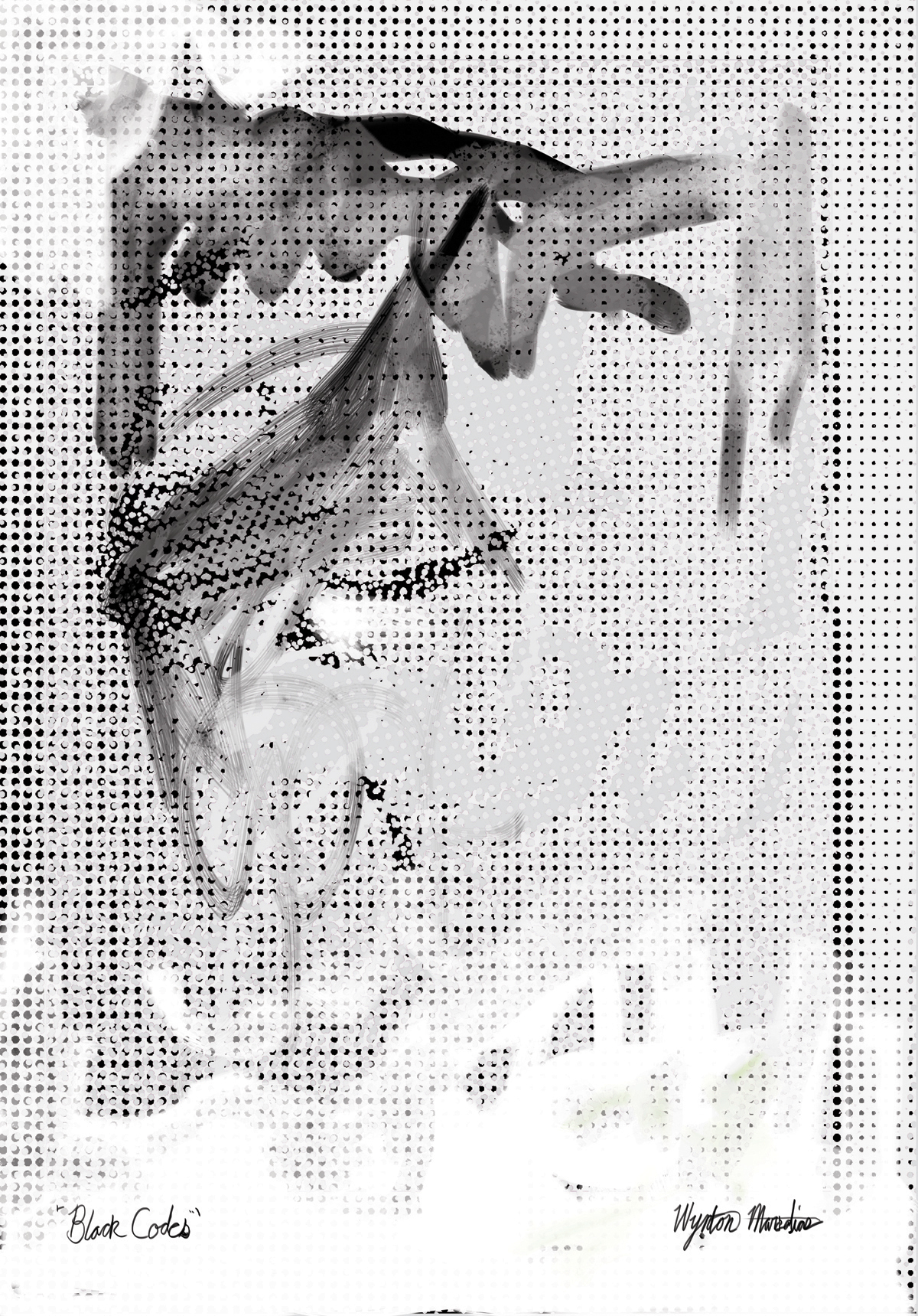
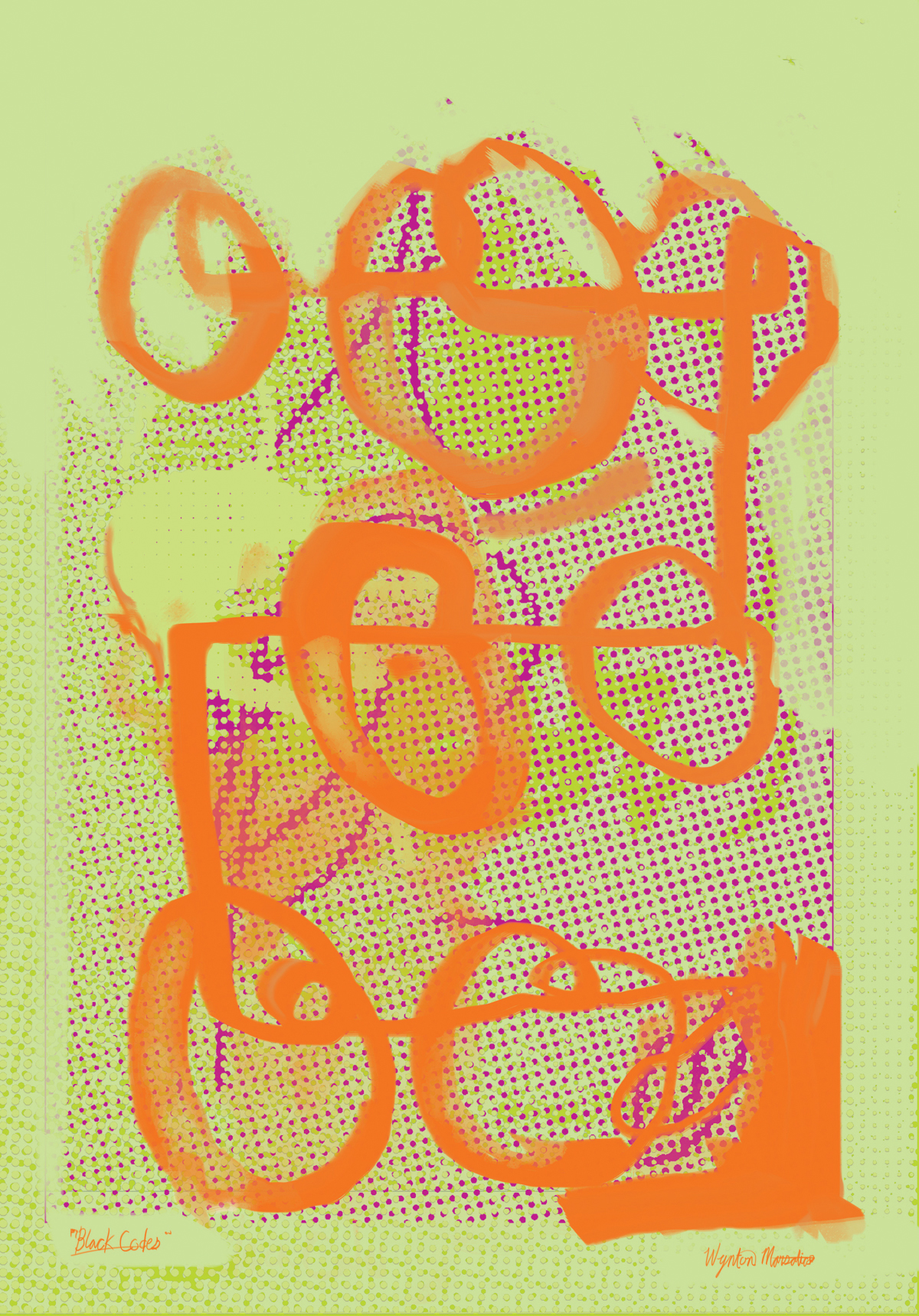
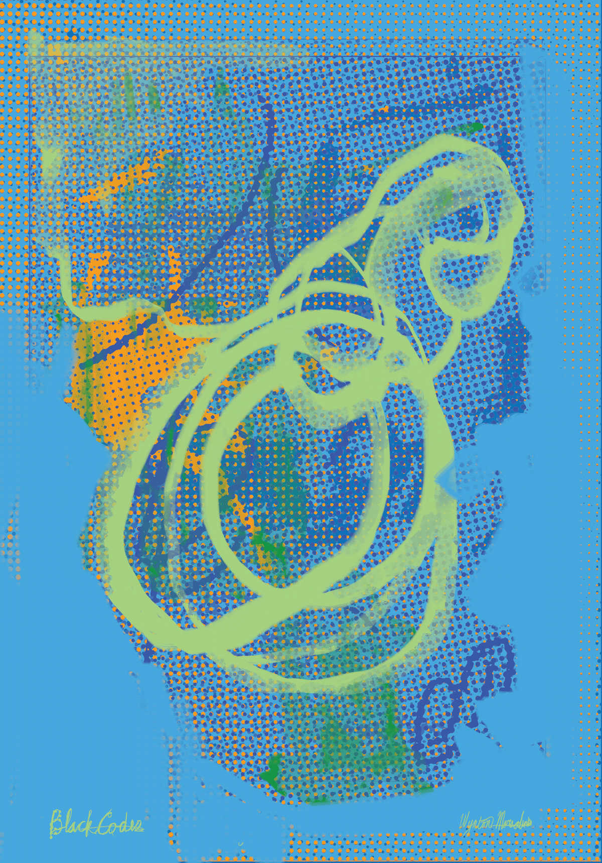
BLACK CODES
by Wynton Marsalis
excerpt from process book
This is what evolved from the question presented in the feedback. The elements used in the background are the same ones explored in earlier concepts, the difference this time is that they remained in constant placement throughout the different variations. I created halftone dots and placed them at different angles to see if the results would show me something that I wasn’t noticing. It was in efforts to create a sense of spontaneity through the arrangement of the dots, angles, and layers. There was some interesting options that started to show but it didn’t have the depth that I was looking for.
Taking the advice in looking up Glenn Ligon definitely had an influence, for it broke away from the clean vector approach. The print-like spontaneity feel of his work also provided more depth to the surface in looking at the way he used transparencies in his black and white paint work. It was his influence that also made me go back to the original drawings and reincorporate them into the compositions as well as larger blocks of color to offset the results produced by the halftone dots.
When it came to exploring the colors I continued to go around the color wheel, creating monochromatic schemes and introduced one of the layers as a complimentary color. It changes through the six variations from trumpet to strings in which one acts the complimentary. The hand drawn elements on top are from the pencil sketches that were conducted earlier in the week. The colors for the drawn elements are chosen from triadic color scheme. I backed off the red white and blue because although it represents America, a variety of colors is a better representation of what America/Jazz actually is.