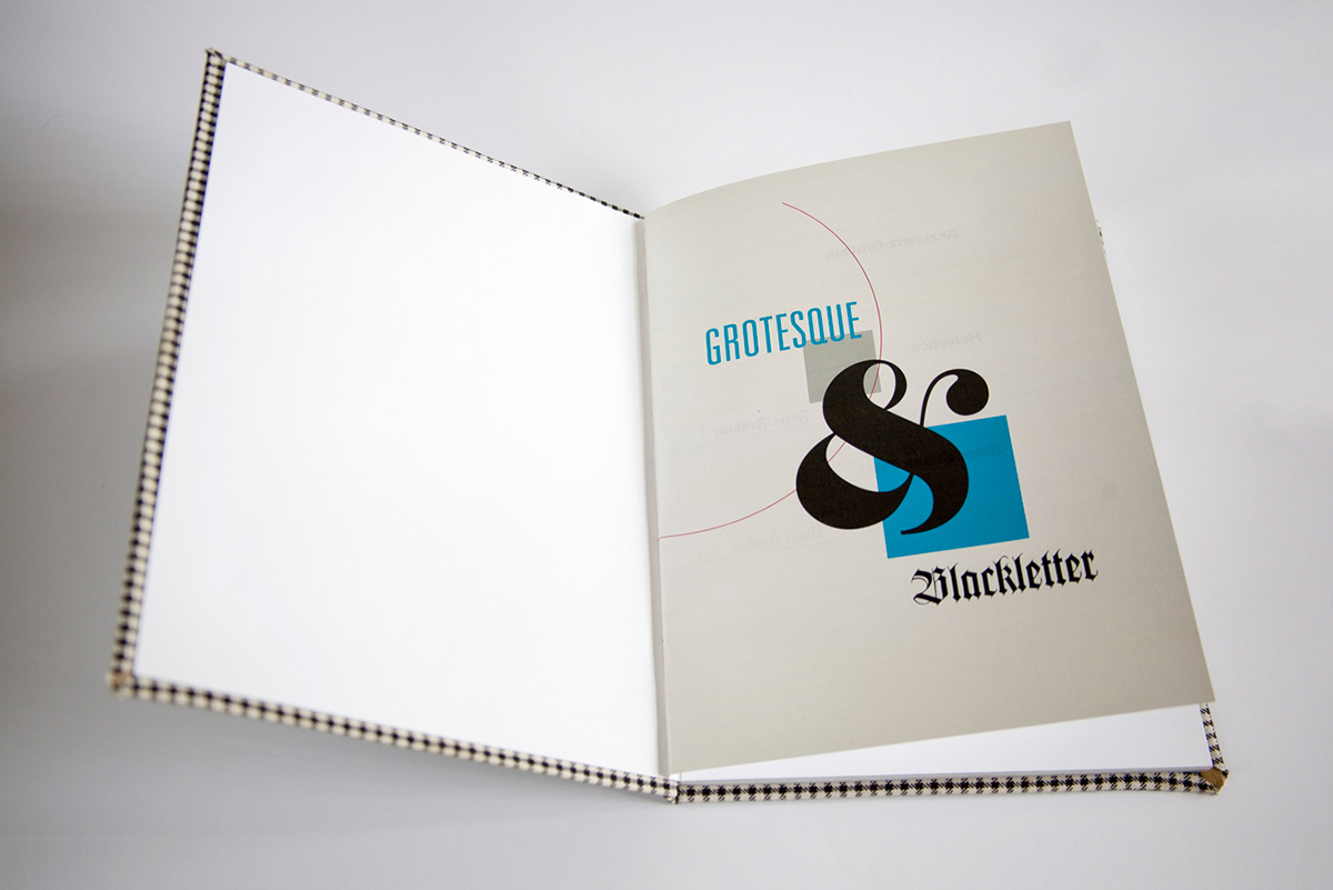
A typographic exploration of unique and timeless Grotesque and Blackletter typefaces.
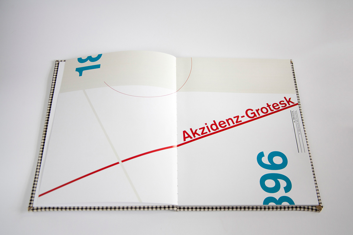
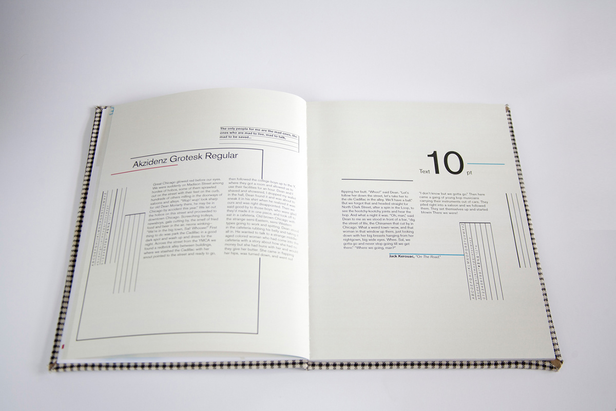
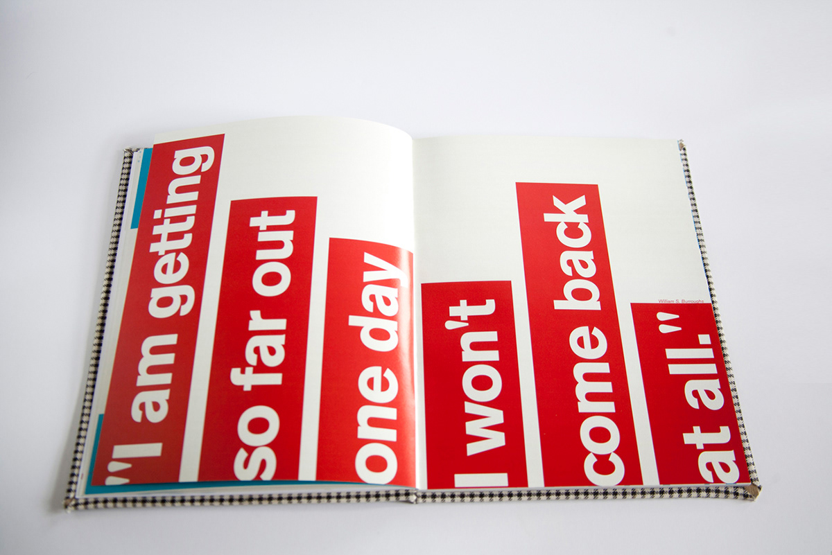
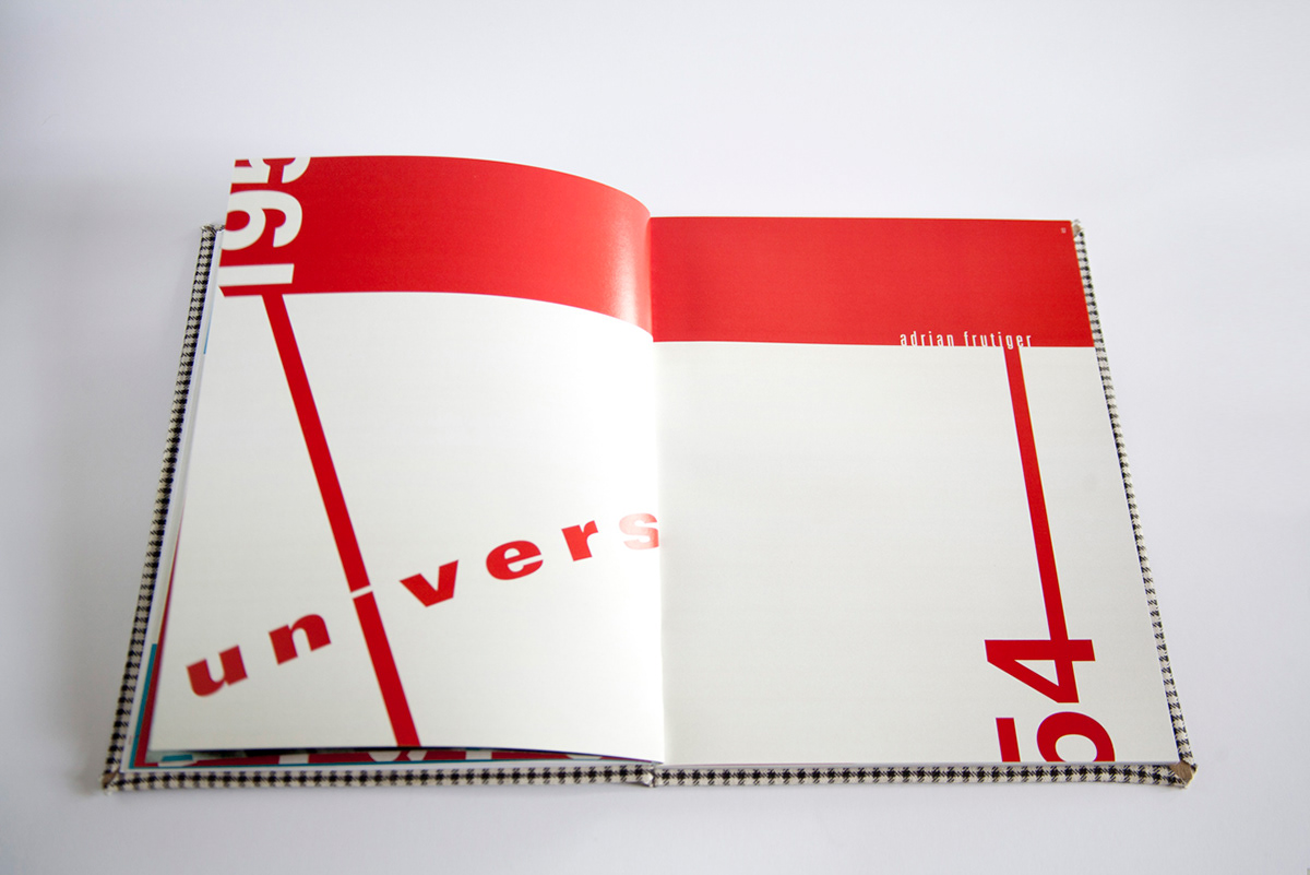
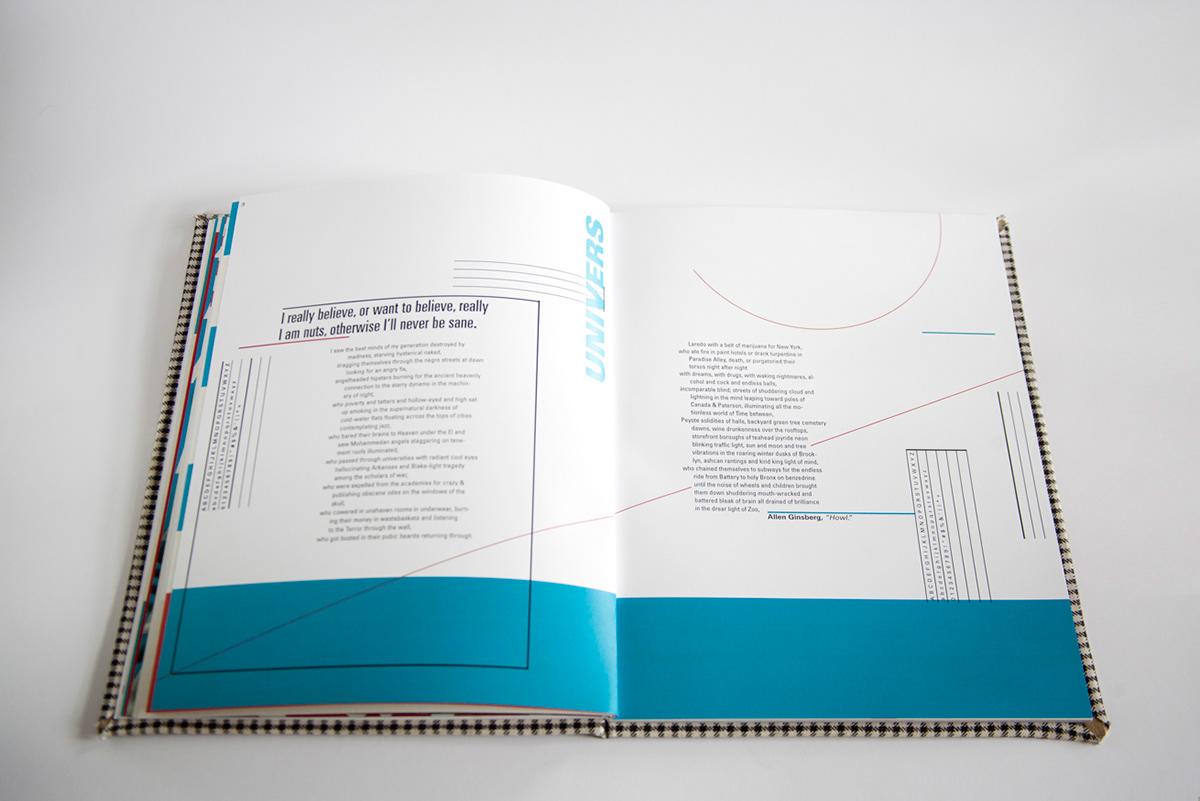
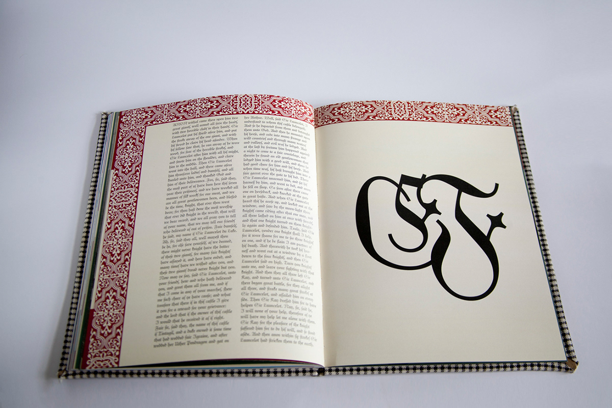
A grid was used for the layout of the entire book. Although complex, the spreads nonobjective elements and text read quite clearly. The pages are separate yet are part of a whole. The compositional unity is due to the use of similar grids on each page and the horizontal alignments of elements from page to page. The text spreads have certain vertical rules that introduce a rhythmical series that connotate a musical staff.
The page dimensions are 8.25 in by 10.75 in.
The book was printed on Neenah's Environment 100PC WHITE Smooth 148 (g/m2).
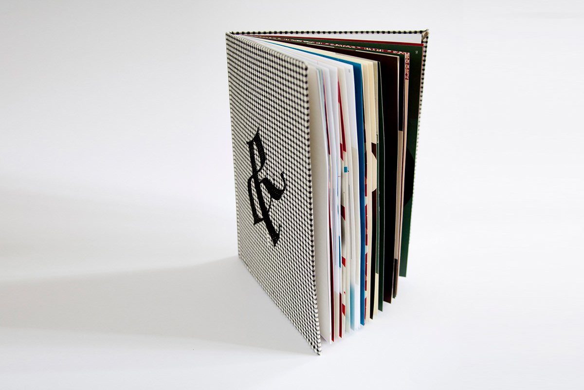
The cover is Houndstooth fabric with an Unger Fraktur ampersand monogrammed on the front and a Fette Fraktur ampersand on the back.
A grid was used for the layout of the entire book. Although complex, the spreads nonobjective elements and text read quite clearly. The pages are separate yet are part of a whole. The compositional unity is due to the use of similar grids on each page and the horizontal alignments of elements from page to page. The text spreads have certain vertical rules that introduce a rhythmical series that connotate a musical staff.
The page dimensions are 8.25 in by 10.75 in.
The book was printed on Neenah's Environment 100PC WHITE Smooth 148 (g/m2).
The cover is Houndstooth fabric with an Unger Fraktur ampersand monogrammed on the front and a Fette Fraktur ampersand on the back.