To rebrand a business In my local area that I feel is in need of a ‘Designers Touch’.
Research | Development:
Cardiff Scuba is 5 Star Padi rated number 1 recreational training facility in South Wales,
I felt that the branding did not reflect this.
I began with researching into the benefits of Scuba diving to get a better understanding of why people should go Scuba Dive.
I then broke down the characteristics of Cardiff Scuba and what the company represented. Fun, Adventurous, Discovery are few of the words that I came across, I aim to implement these characteristics throughout the overall branding.
Logo: I thoroughly manipulated different typefaces to come up with an intelligent logo design, eventually I discovered a fish shape in the negative space of the ‘CU’ in Scuba.
A fish represents ‘Adventure’ ‘Discovery’ and ‘Exploration’ just like the Diver. A slight wave cut through the ‘UBA’ represents ‘Motion’. The rounded typeface had the finishing 'Friendly' 'Playful' feel further inciting the viewer.
Theme: I used the wave and fish from the logo as the main theme throughout the branding, I felt it was a subtle and intelligent touch which not everybody will see at first glance.

Research: Benifits of scuba diving.
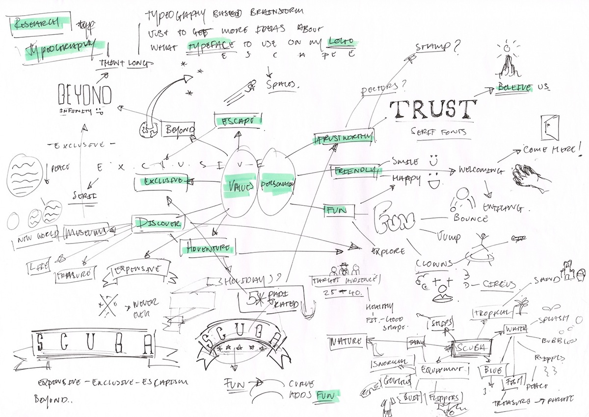
Development: Personality & Values of Cardiff Scuba.

Development: Typeface manipulation.
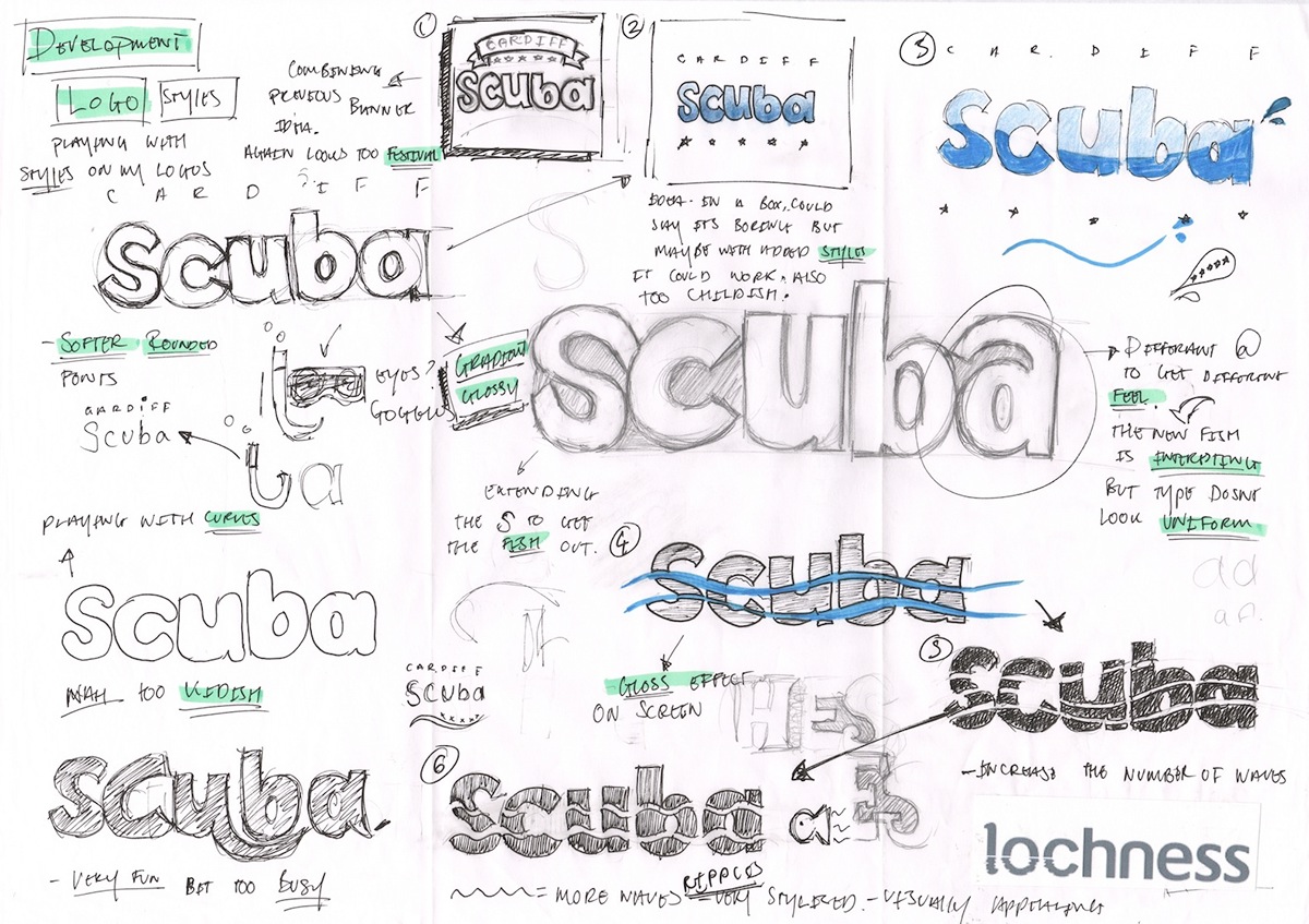
Development: Refining the logo.

Final Logo.

Stationary.
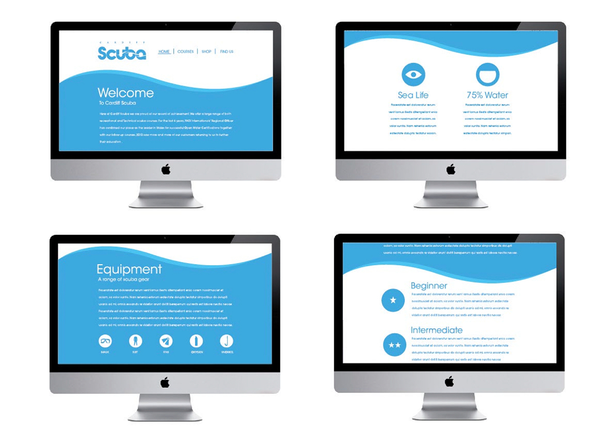
Website mock up.

Product Placement. Logo works on all Scuba gear, Including a pencil!


