
plan #1
#About Symbolization & identification
It is the first time to do the brand vision project. There are many shortcomings in experience and presentation, but it is a very meaningful job.
I hope to use simple symbols to emphasize the overall beauty. Because the client is an investment company mainly engaged in new energy wind power generation, the design content of the first version is based on "wind" and "sustainability" as a whole.
At the same time, as new energy is an emerging industry, I also hope to break the heavy weight of the original investment company logo through the recombination of colors, and use new colors to elicit the "new" elements of new energy.
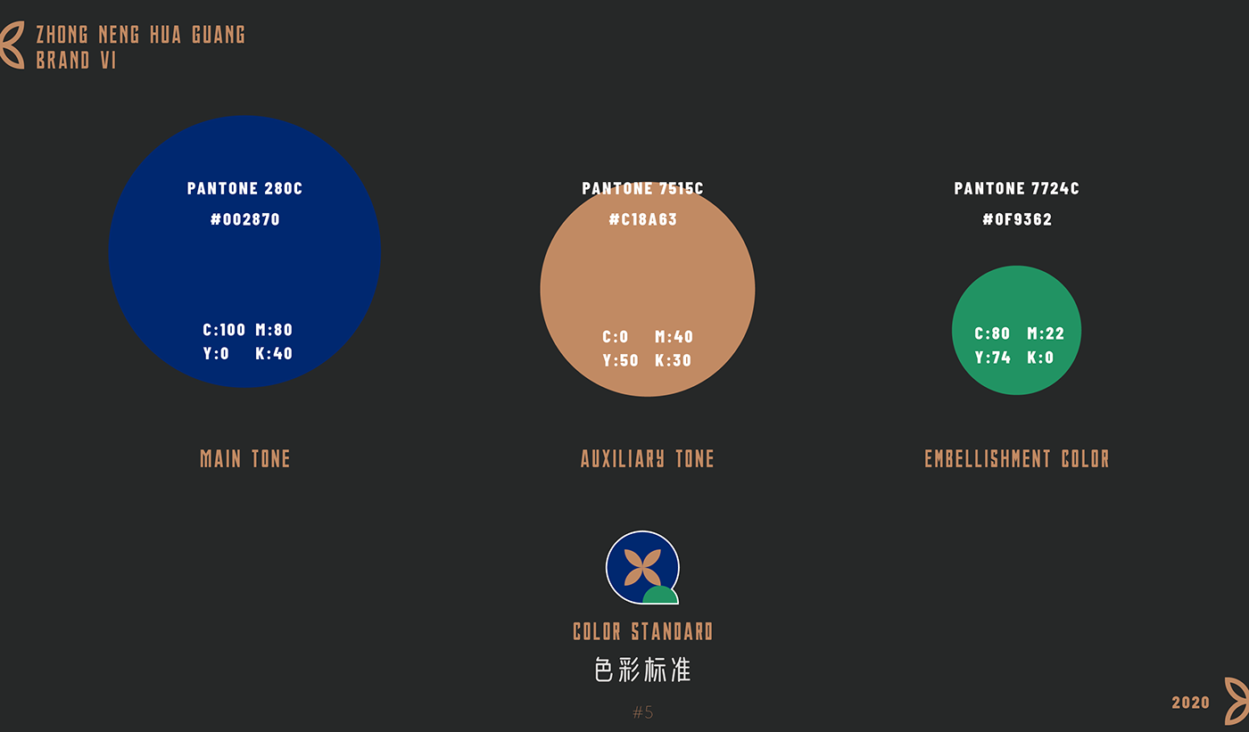
So I extracted the "green" color representing recyclability and environmental protection from the classic dark blue and gold as the overall auxiliary color


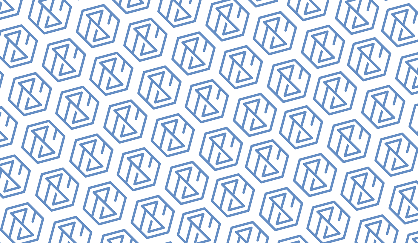
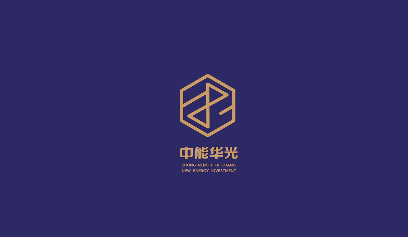
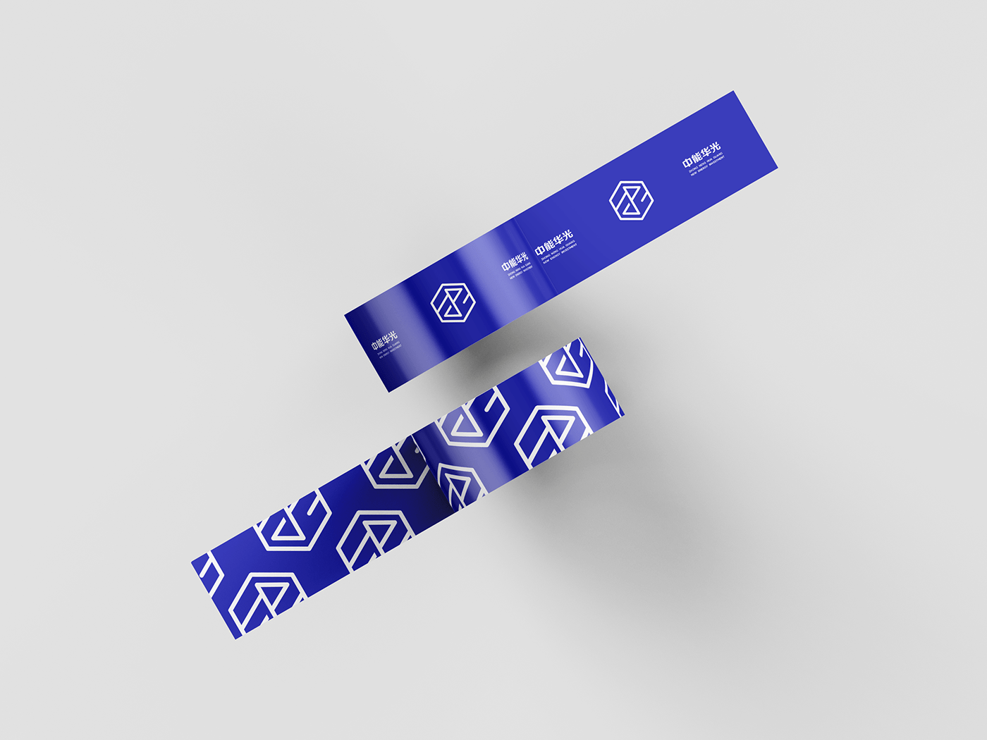
plan #2
#About Classics and connotations
The starting point of the second version is the same, the customer hopes to have a traditional logo that incorporates corporate abbreviations. At the same time, a stable corporate culture is required. So we made a relatively stable version.
Among them, the green brightening scheme in scheme one was abandoned, and the main colors were returned to "dark blue" and "golden" to demonstrate the style of large enterprises.
Among them, the green brightening scheme in scheme one was abandoned, and the main colors were returned to "dark blue" and "golden" to demonstrate the style of large enterprises.
The most important thing is that the category and area used must have a unique display channel, so in the design process, it is also considered whether the LOGO can have a unique symbolism like a complete one when it is not fully displayed.
At the same time, I also used this design style of painting in the promotional materials.
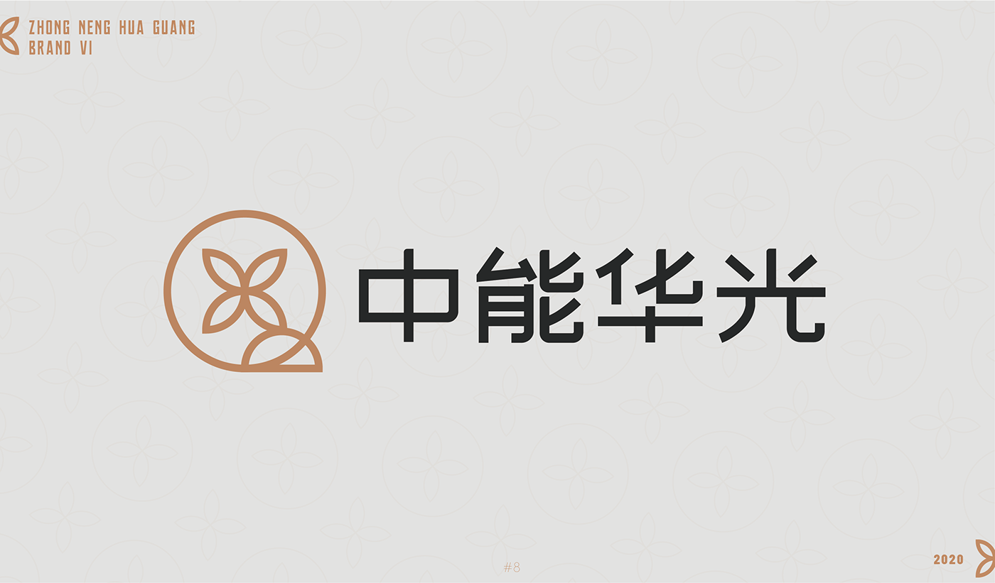
The customer also emphasized one point. The LOGO needs to be more concise and simple, and at the same time it can well display the four English letters "Z, N, H, G", so I designed the plan 2 based on the above direction